Vendia Deck Design

Vendia Deck Design

Vendias brand evolved quickly, and the deck system had to keep pace. I led three launches that moved from values-led visuals to a more corporate, photo-forward direction, without sacrificing usability for Sales and Marketing.

CLIENT

Vendia

CLIENT

Vendia

Role

Lead Communications / Presentation Designer

Role

Lead Communications / Presentation Designer

Tools

Google Slides, figma, Adobe CC

Tools

Google Slides, figma, Adobe CC

How I worked (end-to-end)

1) Discovery & requirements

Aligned with GTM + Design on use cases: sales calls, pitch, exec updates, technical storytelling

Defined constraints for Google Slides (theme styles, accessibility, shared usage)


2) Research & direction

Competitive scan of B2B SaaS decks and presentation trends

Explored two dominant approaches: photo-forward minimal vs layered branded graphics

Chose a starting direction aligned to “Kind Humans,” then evolved based on stakeholder feedback + real usage


3) Build & system design

Created repeatable layout patterns that supported copy + diagrams

Designed a theme system (type, grids, spacing, color rules, photography rules)

Built master templates and reusable components for speed + consistency


4) Rollout & enablement

Shipped decks via Google Cloud for org-wide access

Created documentation so teams could self-serve confidently

Collected feedback and tracked actual usage patterns for iteration

Version 1 Launch
Brand forward foundation

Goal: Launch a rebranded deck aligned with Vendia’s “Kind Humans” direction—friendly, modern, and distinct.

What shipped:

  • Two branded Google Slides themes in Google Cloud

  • Core template system + starter deck for Sales intro calls

  • Presentation usage guidelines (layout, type, spacing, assets)

What we learned:

  • Graphics sometimes limited space for copy + technical diagrams

  • Some text color usage created accessibility/readability issues

  • Teams consistently used only 3–4 layouts, revealing underutilized templates

Title
Gallery image 2
Gallery image 3
Gallery image 4
Gallery image 5
Gallery image 6
Gallery image 7
Title
Gallery image 2
Gallery image 3
Gallery image 4
Gallery image 5
Gallery image 6
Gallery image 7
Gallery image 1
Gallery image 2
Gallery image 3
Gallery image 4
Gallery image 5
Gallery image 6
Gallery image 7
Gallery image 1
Gallery image 2
Gallery image 3
Gallery image 4
Gallery image 5
Gallery image 6
Gallery image 7
Version 2 Launch
Simplified, diagram ready,
higher adoption

Goal: Improve usability and adoption based on real team behavior.

What changed:

  • Updated theme to a more minimal, breathable system

  • Reduced templates to the layouts teams actually used

  • Updated photography rules to include full-color cool imagery

  • Refined colored text rules to improve accessibility across common use cases

  • Updated documentation to match the new system

Result:
More space for copy and diagrams, cleaner hierarchy, fewer accessibility issues, and stronger day-to-day usability.

Title
Gallery image 2
Gallery image 3
Gallery image 4
Gallery image 5
Gallery image 6
Gallery image 7
Gallery image 8
Gallery image 9
Title
Gallery image 2
Gallery image 3
Gallery image 4
Gallery image 5
Gallery image 6
Gallery image 7
Gallery image 8
Gallery image 9
Version 3 Launch
Darker, corporate,
photo-forward direction

Goal: Align the deck system to Vendia’s new darker brand shift and more corporate GTM visual direction.

Collaboration:
Worked closely with the VP of Marketing through iterative reviews to align visuals to brand strategy.

What shipped:

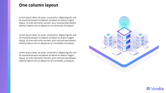
  • New theme built around a researched purple/blue direction

  • Full-image background layouts with minimal overlays

  • Expanded usability deck with unique slides + reusable assets

  • Updated presentation + usability guidelines for the new brand direction

Result:
An executive-ready deck system that matched the updated brand while remaining scalable for teams.

Title
Gallery image 2
Gallery image 3
Gallery image 4
Gallery image 5
Gallery image 6
Gallery image 7
Gallery image 8
Gallery image 9
Gallery image 10
Gallery image 11
Gallery image 12
Title
Gallery image 2
Gallery image 3
Gallery image 4
Gallery image 5
Gallery image 6
Gallery image 7
Gallery image 8
Gallery image 9
Gallery image 10
Gallery image 11
Gallery image 12
Branding Package

Master Google Slide themes: Typography, grids, spacing styles

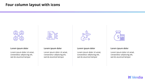
Template library: 20+ optimized layouts for common GTM & exec narratives

Usability deck: ready-to-copy slides, visual assets, and patterns

Documentation: usage rules for color, photography, hierarchy, diagrams, and layout selection

Starter decks: sales intro call deck, and reusable story structures

Outcome

Outcome

Outcome

Led three deck system launches (V1–V3) from concept → rollout → iteration

  • Incorporated feedback from 10+ stakeholders across Design, Marketing, Sales, and leadership

  • Built a self-serve template library (20+ layouts) that improved consistency and speed

  • Reduced design-related support requests by ~40% (internal estimate) by enabling teams to build polished decks independently

  • Improved adoption across Marketing, Sales, and Product with a scalable, on-brand deck workflow